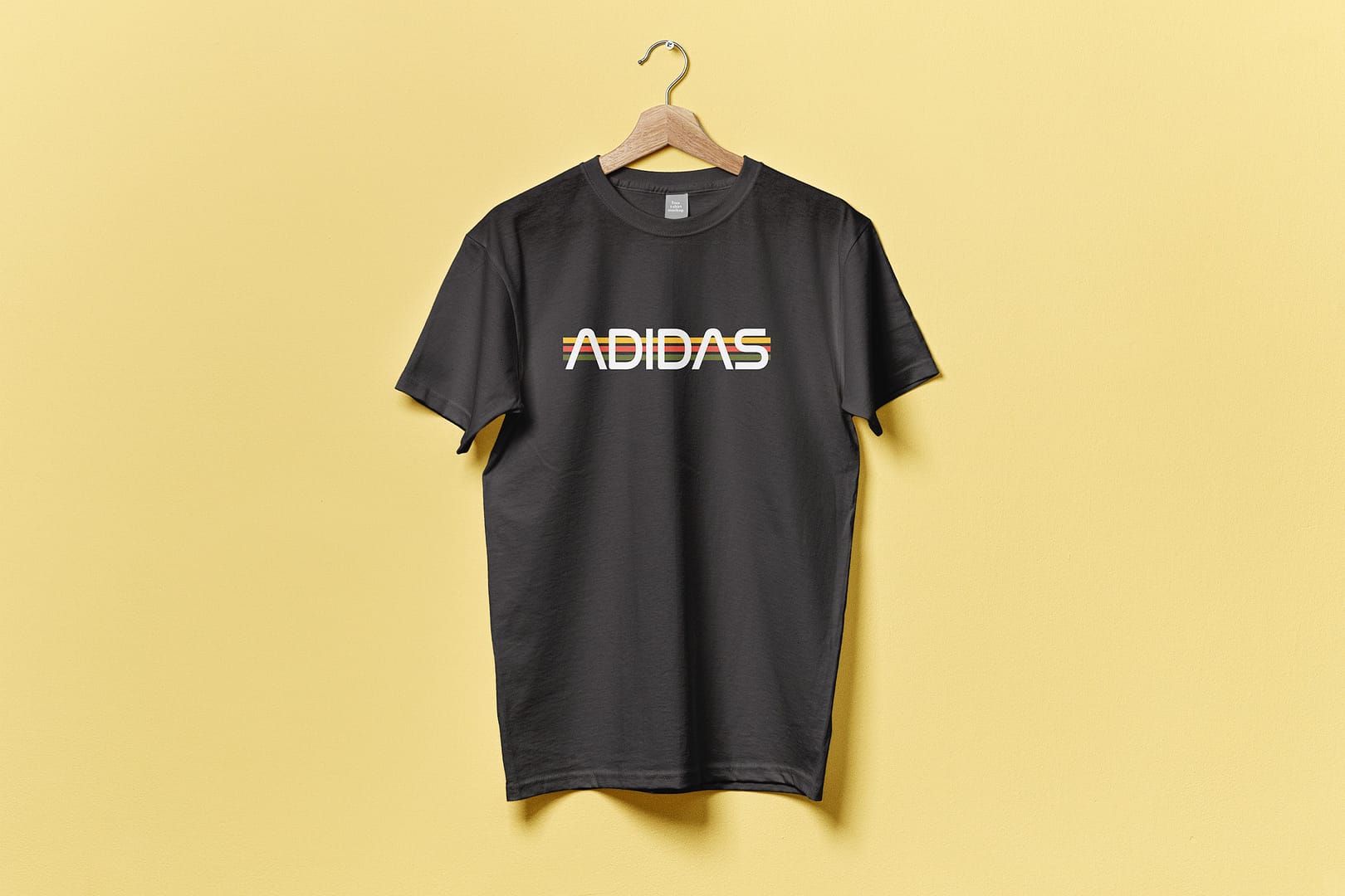
For this project I was required to redesign a company logo and I chose Adidas. I wanted the logo to have the same feeling of the original logo—incorporating the three stripes, maintaining a “sporty” look, etc. I chose a font that I found to be fitting with blocky, bold, futuristic characteristics, but used assorted colors for the stripes as opposed to the original three white stripes.
I started the project by brainstorming ideas and compositions for the logo. As mentioned above, I wanted the logo to portray the brand and company itself, with the athletic style and the three stripes. I chose a font and a color palette I found to be fitting and sketched out layout possibilities. When I found my favorite composition, I created the logo in Illustrator.


